133

We recently have put a lot of effort in coming up with a unique brand name for this community. As you know, naming is hard! After numerous brain storming sessions, we found a great name(and was able to obtain the domain name). It was suggested in a community chat session, and "Arqade" was chosen. "Arqade," obviously playing off the word "arcade," reflects what this site is about. It's a place where gamers hang out, answer each other's questions or simply chit in the chatroom. As a bonus, "Arqade" even contains the acronym "QA" in it!

Why even a new name, some may ask? David gave a detailed explanation in our first name suggestion post. Speaking as someone who's been involved in this community since the early days, I can tell you not having a unique brand name and logo makes it difficult to create design and promotional materials. We have done several promotions for this site in the past, and will do even more in the future to help the community grow.

Logo

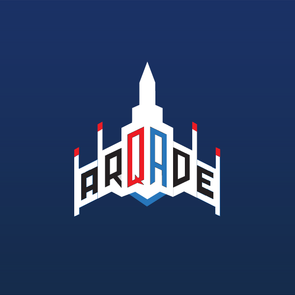
With the new brand name, I wanted to design a logo that's memorable and fitting for the theme. It needed to be able to stand on its own. Arqade/arcade has a retro feel to it. When I think of some of the early video games, Galaga came to mind. Its iconic ship embodies the arcade culture of the early days. "Arqade" in all caps has a great symmetry. After a lot of revisions, I came up with the following logo.

Arqade Logo

I believe this logo design works well, both in form and function. By itself, it reflects the gaming nature of the brand while spelling out the site name. It also has a positive feeling associated with it. A ship, moving forward.

How will it be used in practice? I came up with a few mockups of use cases:

T-shirt

Tshirt

Sticker

Sticker

Moderator/Site card

Moderator/site card

Sponsorship

Sponsorship

Site design tweaks

While the main design focus has been on the new brand mark, I feel the site could use a little tweak too. (No I'm not taking away the lazers!). The existing design already fits the retro arcade theme, and I decided not to deviate away from that. I decided to open up the site for a bigger space theme. After doing a few site take over promotions for popular games, I feel this layout is the most versatile.

Arqade Homepage

As you can see, the site design update still maintains the current look and feel.

I'd love to hear your feedback, and thank you for being an awesome community for the past two years! (whoa it's been two years already??)

45
  • 37
    Really liked this name, glad it was taken, loving the new Logo but I'm really going to miss the heart, perhaps it could be incorporated somehow (like above the users button).
    – Mr Smooth
    Commented Jun 7, 2012 at 17:15
  • 10
    the heart has a cameo in the footer graphic, see if you can find it :)
    – Jin
    Commented Jun 7, 2012 at 17:16
  • 3
    There's a great synergy between the new logo and the up/down vote arrows :)
    – Oak Mod
    Commented Jun 7, 2012 at 17:21
  • 8
    Neat design ... let's hope the name grows on me. Commented Jun 7, 2012 at 17:39
  • 6
    Oooh, I don't like the new badges.
    – Ronan
    Commented Jun 7, 2012 at 17:41
  • 8
    The emphasis on the QA in the middle is amazing. Great job with the logo design. Commented Jun 7, 2012 at 17:57
  • 5
    I love the logo design, fantastic work. I hate the name, goodbye. I'm also not sure I like the proposed site design. It seems too... bland to me. The current site design is fantastic, and I don't see why you couldn't just continue to use it with the new logo.
    – GnomeSlice
    Commented Jun 7, 2012 at 19:23
  • 3
    Will the ship at the top be shooting LAZERS too?
    – Tablemaker
    Commented Jun 7, 2012 at 19:24
  • 6
    As I stated in chat, my main concern is the little bit on the Q that makes it a Q not standing out very much in the smaller mockups or at a distance. I think it might be because the small triangles don't stand out as much. On the t-shirt and mod cards, the Q looks more like an O or a D.
    – FAE
    Commented Jun 7, 2012 at 19:38
  • 2
    Does this mean that there's going to be a new set of top user swag with the new T-Shirt? If so, I'm going to have to get some more rep so I don't drop off page 2 :)
    – ChrisF
    Commented Jun 7, 2012 at 20:42
  • 3
    @ChrisF yes, more shirts for your existing SE wardrobe.
    – Jin
    Commented Jun 7, 2012 at 20:42
  • 3
    My only issue with this name is, it is very hard to say verbally (due to the mismatched Q without a U) and remember how to spell (I naturally want to type a U after a Q, so even knowing in my head how to spell it, I still screwed it up when trying out the domain "arqude.com or "arquade.com"). At least there was a decision though.
    – Resorath
    Commented Jun 7, 2012 at 22:42
  • 3
    @Jin The first thing I saw when I looked at the logo was a skyline, a couple of buildings (with smokestacks!) surrounding an arcade tower. Was that intentionally? (Ex post facto if nothing else? :P )
    – Raven Dreamer Mod
    Commented Jun 7, 2012 at 23:05
  • 3
    An an interwebs denizen, I fear and detest change. However I have to admit that's a pretty sweet design. I for one welcome our new spaceship overlord.
    – Wikwocket
    Commented Jun 8, 2012 at 18:33
  • 5
    As a former Galaga/Galaxians nut in the 80's I like the idea. However my major concern is that at smaller sizes it reads as PROADE or PRQADE.
    – Kev
    Commented Jun 11, 2012 at 1:57

16 Answers 16

60

I'm here since Gaming.SE beta and I will sincerely miss the pixelated heart. But I understand that is time to move on and together with the launch of new name a new logo and design is welcome.

Jin's works are excellent and I love the minimalism of his designs. The concept of the logo also this time is great, the only thing that does not convince me much is the color.

The QA acronym inside the name in great and I only tried to highlight them a bit. I am not a designer and I don't want to be presumptuous, this is only a suggestion of a fan.

enter image description here

8
  • 2
    I agree, needs more color. But I also think it needs a pixelated heart too ;)
    – Rachel
    Commented Jun 8, 2012 at 13:03
  • 13
    I think the emphasis of the QA is important. It's what we are, after all.
    – MBraedley
    Commented Jun 8, 2012 at 14:19
  • 2
    @Jin This .....
    – Tharius
    Commented Jun 8, 2012 at 14:39
  • 4
    I'd not paid much attention to the naming chat, etc, so before this meta post I'd not seen this name. And, you know what, until I saw this answer I hadn't even notice the QA built in to the name, just saw it as just another internet name misspelling to start with - So +1, it really could do with highlighting.
    – DMA57361
    Commented Jun 9, 2012 at 11:08
  • 2
    The design already emphasises the QA, this is just beating you over the head with it IMO. Commented Jun 9, 2012 at 21:13
  • 1
    I'd rather do-away with the pixelated heart, but I'd be all for keeping it somewhere in the new site design (e.g. in the bottom graphic or whatever)
    – Nick T
    Commented Jun 10, 2012 at 20:31
  • 1
    I like the design, but I think it'd be improved if you moved the letters away from the segment division lines a little (i.e. A and R further left, D and E further right) and gave it a more visible line on the Q. In the small version I was asking myself "What's Proade?" Commented Jun 13, 2012 at 13:07
  • @NiQAlasT It's in the footer on an arcade screen.
    – Kalamane
    Commented Jun 13, 2012 at 14:40
40

I'll admit I'm not a huge fan of the name, although I'm sure it will grow on me.

I am, however, incredibly happy that our long national nightmare is finally over and somebody chose something, anything to call our site other than "Gaming".

enter image description here

1
  • It's waaay better than the other suggestions. I can live with this name.
    – Shinrai
    Commented Jun 11, 2012 at 0:14
37

The arqade logo is hard to read. It's a good start, but it doesn't seem like a finished product at this point.

It certainly looks neat, but abandons some basic principles of graphic design. The text reads to many as PROADE or PROAOE, and definitely not ARQADE unless you really try to see it there.

Here's a start on some small adjustments to make it more intelligible:

What does that say? vs. Oh. That's what it was supposed to say.


Why does the 'A' read like a 'P'?

First and foremost, kerning is important for text. Clear space is needed between letters for them to read correctly. There's a decent amount of space in the logo, but it is anything but clear. There's insufficient contrast between the lines background and the side of the letters, making parts of the letters seem to disappear into the background.

The A is almost legible

I spent a minute cleaning up the background and already the 'A' reads more clearly. I'm not saying to get rid of the background, but to move the letters away from the edges and define a slightly stronger contrast between the edges. This smooth interpolation when whomever scaled/rasterized the image is blurring details needed to read the text clearly and this is rather easy to fix which makes me wonder why it wasn't.

Kerning at work

Scaling and stretching of letters is fine, but useful details in our alphabet can be lost if scaled too much or too disproportionately. The slanting of the text along the ship and the stylized font are both cool and hip ideas, but if done improperly, key details necessary to read the text are lost yet again. 'A' has legs. Scale them down too much and they disappear.

It's not that much trouble to either

  • a) move the dividing line in the middle of the 'A' up to extend the legs, but this might sacrifice that following of the line along the middle of the 'R' and not look as stylin' or require additional adjustments to maintain that element of the design.

kind of loses some styling

  • or to b) extend the legs of the 'A' even just a little bit which I think works pretty well.

not bad for a 5 second fix

Why does the 'Q' read like an 'O'?

On Sesame Street, all the episodes brought by the letter Q must have had a vendetta against graphic design. 'Q' is an 'O' with a tail (the tail belies how evil a letter it is). If the tail doesn't show clearly, it's not a 'Q' no matter how much you believe it should be.

The correct solution is to emphasize the tail. In so tight a space, how do you do this without ending up with a mess of black? How can this scale well? Negative space seems to work rather well to this end.

The 'Q' is for Quality

Why does the 'D' read like an 'O'?

The only difference between a 'D' and an 'O' is that the left side is straight. With a blocky font, using corners where there would be rounding, it's actually the 'rounding' of the right side of the 'D' which makes it distinct by making the right side noticeably smaller than the left side. If the font were not slanted along the bottom of the ship, this wouldn't be a problem, but because it is, it looks similar to a perspective effect being applied to an 'O'.

To make the 'D' read more clearly, the right side of the 'D' needs to clearly be different from the left. To keep the blocky effect, the right side should be made smaller, almost up to the point of being a triangle if needed. Alternatively, some slight rounding could be brought back in to the corners of the 'D'. I realize this breaks some of the blocky symmetry of the styling applied here.

A small change can make a big difference

Personally, I didn't find the 'D' to look too much like an 'O', but this is what I've been hearing from others and I do see their point so it is worth noting.

Contrast

This is by no means finished in my opinion. The 'A' and 'E' don't stand out enough from what's behind them. I know changing colour palettes is a sticky problem, but going with something just a touch lighter makes a big difference as the current blue for the outside of the wings is too similar to the black of the text.

Brightening up your day

Do we even need text in the logo?

The old logo had no text. The text was placed beside the logo. Do we even need the text smeared across our groovy space ride? I think it could be placed beside or at the very least above or below the logo without causing a problem. Placing it below, we could even stylize it like it like the text were exhaust from the ship's engine systems and use a more accentuating colour scheme (on a dark blue background as exists in the current theme, orange/yellow/white text would stand out quite nicely (example to come in a bit).

2
  • 6
    I like it, particularly the change to the Q and the lighter background colors.
    – Oak Mod
    Commented Jun 17, 2012 at 5:08
  • The lighter background colours makes the biggest difference for me, but now I've noticed the A and E slightly overlapping the background it's really annoying me!
    – fredley
    Commented Jun 18, 2012 at 9:42
16

I'm really glad this name was chosen. Love the design, thanks again to Stack Exchange being awesome people!

1
  • 13
    Only problem: Lack of pixelation. Building this in Minecraft will be challenging...
    – fredley
    Commented Jun 7, 2012 at 18:10
14

Is the site also gonna get a new favicon? I'm gonna miss the heart but...

I made a little attempt at an animated one:

arqade favicon!

I am definitely not a designer though, I just have fun doodling on favicon.cc. I'm sure if Jin's designing one, it'll be better.

EDIT: I also made a different one without the blue background:

favicon without background

And a meta version:

meta favicon!

6
  • 1
    yes the favicon will be updated too. I love yours! awesome!
    – Jin
    Commented Jun 12, 2012 at 0:39
  • 2
    On a technical note, I don't think animated gifs are accepted as favicons. but using a still of the second icon (the one with no background) would be awesome.
    – Fredy31 Mod
    Commented Jun 12, 2012 at 2:22
  • 3
    do you mind if I use a slightly modified version of yours? (the 2nd one). I think it looks great, better than anything I came up with.
    – Jin
    Commented Jun 12, 2012 at 16:56
  • 1
    @Jin I don't mind, I'd be honored. You don't need to mention me or anything. Awesome!!
    – PileOfDuty
    Commented Jun 12, 2012 at 17:10
  • @Jin there's a meta one there too if you want to use it.
    – PileOfDuty
    Commented Jun 14, 2012 at 0:39
  • @Fredy31 By the way it's not an animated gif, it's an .ico file. If you go to the links above the images you can see that it will animate in your browser tab if you have firefox or a newer browser. For IE you need to provide a still version as well though.
    – PileOfDuty
    Commented Jun 14, 2012 at 0:41
13

Just going to make a quick suggestion, to keep the beloved heart around. Perhaps making the heart into the badge icon would work? Just have 3 different colors?

1
  • 3
    The beloved heart heart isn't gone. It's still part of the meta sites main template. You just need to find it. Although I agree @jin should add it to the main site in the same place...:)
    – Wipqozn Mod
    Commented Jun 13, 2012 at 13:16
11

So I made a 31x31 pixelated version, which could be useful to some people:

enter image description here

enter image description here

4
  • 2
    I don't think there's any point in trying to maintain the name on the small version, given that it's pretty unreadable at this size. Maybe just the plane? Commented Jun 8, 2012 at 13:48
  • 8
    @YiJiang Legibility is not what I'm going for. To be honest, this is just for me to build at 1m/px scale in Minecraft.
    – fredley
    Commented Jun 8, 2012 at 14:08
  • Need a pointier tip IMO :P
    – Nick T
    Commented Jun 10, 2012 at 20:32
  • 1
    Needs to be bigger ^_^
    – Rachel
    Commented Jun 11, 2012 at 15:18
9

Nice. Now my boss will stop thinking I spend my work hours on a dating website !

3
  • 1
    Your boss thinks a site called "Gaming.Stackexchange" is about dating?
    – bwarner
    Commented Jun 13, 2012 at 17:06
  • 2
    @bwarner sound that different from "Plenty of Fish"?
    – Nick T
    Commented Jun 13, 2012 at 17:13
  • 6
    @bwarner the red glowing heart did the trick ;)
    – Anto
    Commented Jun 13, 2012 at 21:21
4

Seeing as the name has changed will we be also changing the twitter handle? If so can the community make use of it?

3
  • 2
    Once the new domain name is up, yes we will change the twitter handle. I've been using @ StackGaming for a while now (see this meta post) and will continue to do so with @ thearqade.
    – Lauren Staff
    Commented Jun 7, 2012 at 17:46
  • 2
    @Lauren Have you inquired with twitter about getting them to release @arqade? It appears to be an inactive/spam account, so it should be 'available'. Commented Jun 7, 2012 at 23:18
  • @LessPop_MoreFizz we've looked into getting "squatted" twitter accounts before, but unfortunately the only way to do it is to contact the person and ask. In this case it's not clear who @ arqade is, and unfortunately Twitter doesn't really provide tools that help.
    – Lauren Staff
    Commented Jun 8, 2012 at 15:07
4

After seeing fredley's version, I made this version, which is 1/4 scale and as true to the original as I could make it while also maintaining symmetry. This version is 79x83 pixels.

Arqade pixel art

I'm also offering up the Gimp xcf file that served as the intermediate step.

2
  • I'm going to have to spend days shearing to build this!
    – fredley
    Commented Jun 11, 2012 at 11:50
  • 3
    @fredley: that's what creative mode is for.
    – MBraedley
    Commented Jun 11, 2012 at 11:51
2

Awesome. I assume it is too late to incorporate the new name into the impending flood of Diablo 3 themed shirts that are going out?

14
  • 9
    It's too late, the shirts are in production already. But look on the bright side, those will become uber-ultra-limited edition one time only print of the "gaming.se classic" design.
    – Jin
    Commented Jun 7, 2012 at 18:03
  • 1
    My 'coin' t-shirt got faded in the wash, it'll be irreplaceable now :'-(
    – fredley
    Commented Jun 7, 2012 at 18:08
  • 7
    @fredley so it's "vintage" now :) we plan to send out another round of top user swag with the site re-branding. Shirts will be digitally printed this time so they'll be a lot more durable.
    – Jin
    Commented Jun 7, 2012 at 18:14
  • 1
    @Jin :D You guys really are the best
    – fredley
    Commented Jun 7, 2012 at 18:15
  • @Jin Top users of all time or the year or what? Commented Jun 8, 2012 at 7:49
  • 1
    @Mr.November top user of all time. last time we did it, it was for the top 2 pages. But the community has grown a lot since, so we may up the page #.
    – Jin
    Commented Jun 8, 2012 at 14:49
  • I really hope it's more than 2 this time (I'm on page 3) Commented Jun 9, 2012 at 1:49
  • 2
    @Jin Vintage? OMG SELL FOR 50 BUDS PRICE IS FIRM
    – badp Mod
    Commented Jun 9, 2012 at 16:16
  • 6
    Turned out the shirts aren't in production yet, the printshop is waiting on the sizes break down. So I went ahead sent them an updated design with the new site name!
    – Jin
    Commented Jun 11, 2012 at 16:07
  • @Jin I have never been sadder in my operating history T_T
    – user9983
    Commented Jun 13, 2012 at 17:09
  • 1
    @OrigamiRobot don't be sad, be happy.
    – Jin
    Commented Jun 13, 2012 at 17:14
  • 1
    @Jin I hate the new name. I love the spaceship, but intentional misspellings are the worst. The Diablo shirt was going to be a fond reminder of better days.
    – user9983
    Commented Jun 13, 2012 at 17:16
  • @Jin any chance of getting a peak at the updated design?
    – JamesCW
    Commented Jun 13, 2012 at 17:35
  • @JamesCW the design is pretty much the same, just the url update.
    – Jin
    Commented Jun 13, 2012 at 17:54
2

I like the name and think the logo does a great job of conveying a clear message.

To everyone involved in this, great job and thank you.

2

I don't like it! Why did they change it??

Still wondering Why exactly they changed it? I really liked "Gaming" as I am sure a large number of other users also did. Gaming is so straightforward and accurate. ArQAde is clever, with the QA meaning Question and Answer, but nevertheless it also sounds strange IMHO.

2
  • 7
    In short, we're getting a level up. See it like this.
    – Fredy31 Mod
    Commented Jun 14, 2012 at 1:34
  • 5
    +1 For addressing the elephant in the room.
    – Muhd
    Commented Jun 19, 2012 at 3:14
2

I made a version of @fredley's design, but without the text. It is also 32 by 32 like his.

Here it is:

Textless 32 by 32 logo design

1

Wow!

When I first saw this name in the list of sites, Ithought there was a new stack exchange, then wondered what on earth it was about, it was only until I saw the url that I kind of understood it, and then only after reading this post did it make sense.

It's obvious what gaming is about. It's completely unobvious what arqade is about.

Frankly the new name is dumb.

4
  • You're looking at it from a perspective of someone that is already familiar with Stack Exchange. That is a very small percentage of the audience that we are trying to reach (since most of those people that are interested in gaming are already here).
    – bwarner
    Commented Jun 24, 2012 at 21:36
  • 3
    @bwarner So, from the perspective of a user new to SE, arqade is more obvious than gaming?
    – Sam DeHaan
    Commented Jun 25, 2012 at 18:06
  • 1
    @Sam From the perspective of a new user, it is much easier to remember that the cool site they stumbled upon is called "Arqade" than to remember it is called "Gaming.StackExchange". The found the site through a Google search, its pretty clear what the site is about once they got here. Its the remembering how to get back that is the challenge.
    – bwarner
    Commented Jun 25, 2012 at 18:32
  • @bwarner I disagree, but it's speculation by both of us at this point. /shrug.
    – Sam DeHaan
    Commented Jun 25, 2012 at 19:55
-4

I'm going to go the other way on this and present an opposing view.

The styling is retro. Is that good?

I would argue, no. I mean you guys went all the way and did full out design and T-Shirts and everything, but I have to say, as gently as possible, that I don't like the look.

I think it's too retro.

Retro is fine, for a site about retro, but this site isn't about retro. It's about games from all times, and the actual site content tends towards modern games.

So the logo is misleading in that way.

The name is also retro sounding. When was the last time you went to the arcade? Arcade's aren't that popular anymore, again too old-sounding.

So, I'd say, although this design is not bad, I'd say try again.

2
  • 1
    The site design has always had an 8-bit retro style (except during some of the promotions). The new styling isn't that much of a departure from the old styling. In fact, it uses something like 90+% of the same assets.
    – MBraedley
    Commented Jul 19, 2012 at 13:03
  • Yes but, the old styling was at least Legend of Zelda inspired, with the 3 hearts. This is even before that time, it references the old vertical scrolling shooters, like 1942 and Lunar Lander. Too old.
    – bobobobo
    Commented Jul 19, 2012 at 13:45

You must log in to answer this question.

Not the answer you're looking for? Browse other questions tagged .