27

Hi all,

Sorry about the delay on the logo. I was going to wait on the logo until we settle for a domain name. But due to the domain name policy change, I think I'll design a logo for the gaming theme, instead of tied to a particular name.

I checked the current logo thread we have. The highest voted one is of a retro pixel art. I like this style a lot, as you have seen from the site design. I believe everyone who visits this site, new comers or seasoned users share one thing in common: they love games!

So here's my take. It's a pixel red heart, also the symbol for "life" in retro games.
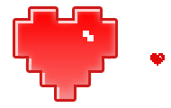
alt text

The above are the Apple touch icon and favicon.

See it in action in the header: (click to see full res version)

alt text

Let me know what you think!

12
  • related
    – badp
    Commented Oct 5, 2010 at 7:04
  • 3
    I like it a lot. If only we were extralife.com... (actually it seems only parked)
    – Zommuter
    Commented Oct 5, 2010 at 7:04
  • @Tobias I'd rather something like zerocontinues.com (avail) to go with it
    – badp
    Commented Oct 5, 2010 at 7:21
  • @badp: I don't know... It's been a while since I played a game with limited continues. But we obviously agree that the logo is a good source of inspiration for a good domain name
    – Zommuter
    Commented Oct 5, 2010 at 7:29
  • extralife was suggested, btw.
    – Zommuter
    Commented Oct 5, 2010 at 7:32
  • 6
    I'd take either of those in a heart beat.
    – tzenes
    Commented Oct 5, 2010 at 7:32
  • @tzenes: then upvote both. I can't find zerocontinues.com as a suggestion though
    – Zommuter
    Commented Oct 5, 2010 at 7:35
  • 2
    By the way, I'm still not sure how obvious is it that the "ask question" spaceship is actually a button... though I haven't seen the site in action.
    – Oak Mod
    Commented Oct 5, 2010 at 8:59
  • @Oak, I agree with you. I think the "Questions" "Tags" "Users" "Badges" and espeically "unanswered" tabs need to differentiate themselves from the background a little more as well. Commented Oct 5, 2010 at 14:14
  • @Tobias I did a long time ago
    – tzenes
    Commented Oct 5, 2010 at 15:50
  • 5
    A wild Jin-Logo appears. It uses Inspire on your Domain-Name Search. Its super-effective. Commented Oct 5, 2010 at 19:55
  • Awesome, I love it!
    – Lazer
    Commented Oct 6, 2010 at 18:45

5 Answers 5

13

That is just… inspiring. I instantly loved it. VERY well done.

Not to kick a hornet's nest, but that logo begs for a tagline or a site-wide meme. It would be catchy to talk about the site on the Internet as ♥ gaming or I ♥ gaming.

The logo with a URL instantly becomes a great t-shirt or bumper sticker. Written out, it makes a great name for the site (Heart Gaming or I Heart Gaming). Heartgaming.com is already available. Iheartgaming.com is recently parked.

Nice.

5
  • HeartGaming I like. Commented Oct 5, 2010 at 21:14
  • why not "Love Gaming"? it focuses more on what the heart represents other than what it actually is.
    – juan Mod
    Commented Oct 5, 2010 at 23:00
  • (I meant as a tagline, the domain is obviously taken)
    – juan Mod
    Commented Oct 5, 2010 at 23:06
  • 2
    @Juan Manuel: I would say 'no' because "Love Gaming" misses the pop culture reference (i.e. the meme). When people see "I ♥ NY", they say "I heart New York". That's the appeal; the joke; the pop culture reference. Hence, "Heart Gaming." Commented Oct 6, 2010 at 14:06
  • 2
    @Juan Love Gaming sounds more like a dating site.
    – tzenes
    Commented Oct 6, 2010 at 14:30
12

Not only do I fully approve, I also find it cool that it forms a "love gaming" sentence :)

3
  • 3
    yeah, actually, why not stick with gaming? as in "I ♥ gaming"?
    – Zommuter
    Commented Oct 5, 2010 at 8:11
  • love that love gaming pitch
    – juan Mod
    Commented Oct 5, 2010 at 13:16
  • @Tobias, I added something like that to the suggestion thread, crediting you. Commented Oct 5, 2010 at 16:52
2

First off, well done.

I discussed in another thread the major problems facing the Stackexchange branding. Fortunately gaming faces almost none of them.

While Stack Exchange does still have a schizophrenic brand identity, the most stronger brand of Stack Overflow is actually beneficial to a site about video games.

What would programming experts know about video games? Probably a lot, they are programmers and nerds.

That said, we could do worse than Gaming as our logo.

2
  • 1
    Ahem, I prefer geek. :-P
    – ahsteele
    Commented Oct 6, 2010 at 21:03
  • 2
    @ahsteele I prefer Ogre. It has a nice ring to it.
    – tzenes
    Commented Oct 6, 2010 at 21:19
1

Games that use hearts for life often used multiple hearts with some empty, or parts of the heart missing to show the life lost. See Zelda for example.

I'm betting you found all that in your own research. Have you tried either of those for the logo? I'm willing to bet we don't want multiple hearts, but I'm curious how everyone feels about one heart with a piece missing.

Good work, either way.

7
  • 1
    NES Zelda is where I got my idea from! I did think about having multiple hearts with some empty.. But it seems to me it'd send a message of some sort. But I don't know what it would mean. Also single heart is good for favicon/apple-touch size.
    – Jin
    Commented Oct 5, 2010 at 20:17
  • 2
    Have to agree with @Jin on this one. I feel that a (half) empty heart gives the impression that you're not as strong as you could be, or that you're dying, based on game nomenclature.
    – TheQ
    Commented Oct 5, 2010 at 20:20
  • 1
    @TheQ On the one hand, low health is an emergency and we're all about fixing emergencies. On the better hand, the item that helps you in the emergency is generally a full heart, and you'll be at a full heart after visiting us. So it's double-win to use a full heart!
    – Grace Note StaffMod
    Commented Oct 5, 2010 at 21:13
  • @Grace Agreed, and it seems befitting with the trend of comments for "I <3 Gaming" to use a full heart anyway.
    – TheQ
    Commented Oct 5, 2010 at 22:10
  • @Jin: however, you could add an empty heart to the ask question button as in "help!!" edit although a rupee or heart container wouldn't hurt either
    – Zommuter
    Commented Oct 6, 2010 at 7:08
  • 1
    this just in: the empty hearts will make an appearance on the site! if you can find it... :)
    – Jin
    Commented Oct 6, 2010 at 16:46
  • @Jin Nice use of the empty hearts, good use without imposing negative connotations
    – TheQ
    Commented Oct 7, 2010 at 19:04
0

Shouldn't the bevel effect also come with a "dark highlight", or whatever the term for that might be?

You must log in to answer this question.

Not the answer you're looking for? Browse other questions tagged .